What is Quinoa to go?
Gochi Super Food is a Melbourne-based brand offering nutritious, ready-to-eat meals designed for busy, health-conscious consumers. The concept is built on delivering maximum convenience without compromising on nutrition, featuring a range of products made from wholesome, natural ingredients.
Currently available in IGA and Woolworths across Australia, Gochi is positioned as a go-to option for quick, healthy meals that fit effortlessly into a modern lifestyle.
Packaging Design
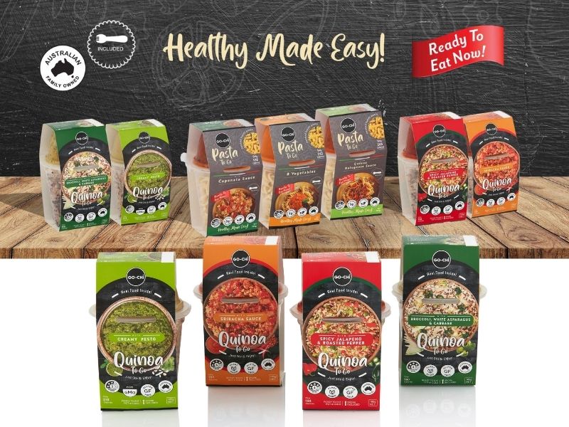
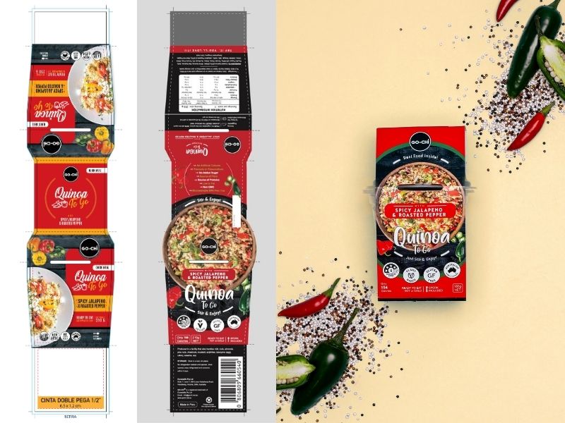
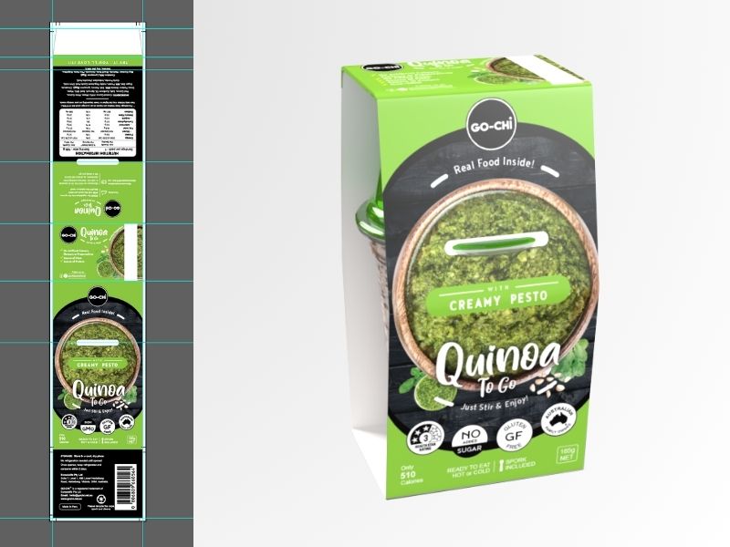
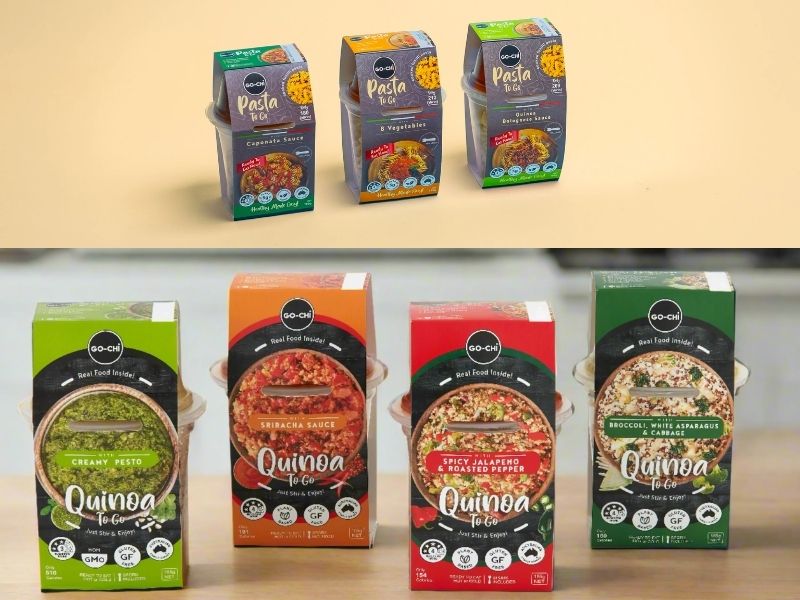
Quinoa To Go
Pasta To Go
Gochi Snack
3D Packaging
3D Mock-up presentation
Presentation
Branding Presentation
Marketing Materials
Social media
Flyer
The Challenge
My role in this project was to design packaging for the Gochi “Quinoa & Pasta To Go” range, which included multiple flavors. The brief required the packaging to function as a visually cohesive product family, while also showcasing distinct ingredients and flavor profiles through design.
5W
To begin, I applied a strategic design thinking approach using the 5W framework:
- What: A healthy, ready-to-eat meal featuring quinoa or pasta
- Who: Health-conscious individuals looking for convenient meal options
- Where: Supermarkets like IGA and Woolworths
- Why: To offer nutritious alternatives in a market saturated with processed food
- When: Ideal for lunch breaks, on-the-go snacking, or post-workout refuelling—especially during busy workweeks or health-focused seasonal periods
The Design Process
Before diving into visual development, I conducted in-depth competitive research focused on:
- Packaging trends within the Australian health food market
- Visual language used by competing brands
- Shelf positioning and product placement strategies, including color coding, hierarchy, and visual navigation
- Consumer behaviour, understanding how customers scan shelves and make decisions within seconds
This research informed not only the look and feel of the packaging, but also structure, usability, and readability, ensuring the product would be both attention-grabbing and intuitive.
Design Strategy & Results
The final design prioritises bold, vibrant colors to differentiate each flavour and capture attention quickly and crucial in high-traffic retail environments. Ingredient illustrations were integrated to highlight freshness and flavor, while a clean, structured layout supports easy navigation of product details.
Rather than just focusing on aesthetics, the design was guided by UX and UI principles adapted for physical packaging:
Clear hierarchy of information (flavour, ingredients, nutritional benefits)
Easy-to-read labels for fast decision-making
Visual consistency across the range for strong shelf presence