From Logo Concept to Brand Foundation
This project showcases a creative exploration of a brand identity for Jane Bunn, the respected weather presenter at Channel 7 News Australia. Starting with an initial logo draft concept, this piece delves into the meaning behind the design choices, the strategic use of colour, the underlying creative thinking, and the development of preliminary brand guidelines.
The logo for Jane’s Weather needs to be distinctive, memorable, practical and simple in form. It needs to convey the intended message, as well as be able to remain effective at any size without colour needed.
Consensus Forecast
Most forecasts or apps give users data from a single weather model. At Jane’s Weather, we combine data from models spanning the USA, Europe, Canada and Australia into one easy-to-use model, to provide the most complete data available.
Alerts Service
Using traditional forecasts, a user needs to proactively find and understand conditions related to their needs or property. At Jane’s Weather, we’ve created industry-specific Alerts to ensure any business that is affected by the weather never misses an opportunity and minimises risk.
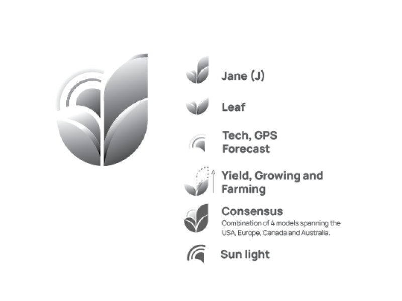
Logo Draft Concept & Meaning
The foundational element of any brand identity is its logo. This section presents an initial logo draft concept developed for Jane Bunn. The design aims to be both memorable and reflective of her profession and approachable personality.
The intention behind this design is to create a logo that is not only visually appealing but also carries inherent meaning related to weather, trust, and the individual it represents.
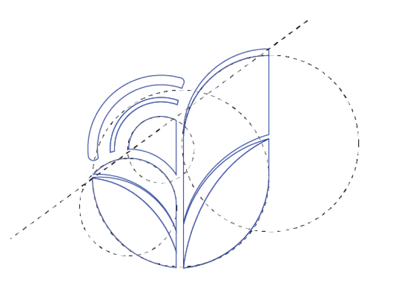
Structure
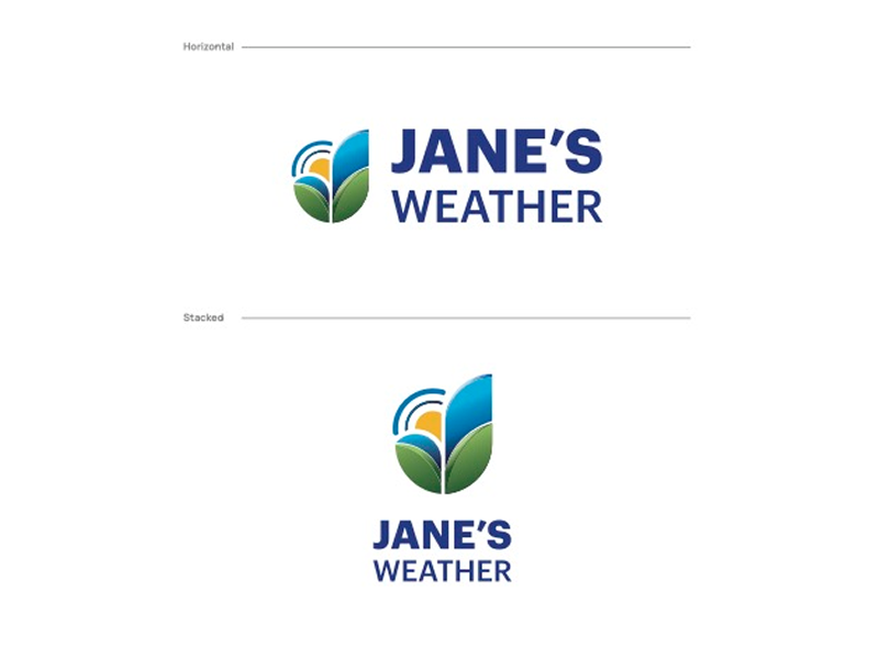
The structure of the Jane’s Weather logo provides a modern approach and balance while demonstrating an organic nature.
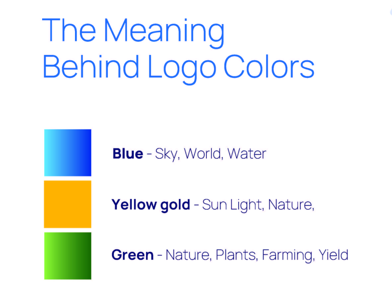
Colors
The logo incorporates three primary colors, each carrying significant meaning:
- Blue: Represents the sky, the world, and water, suggesting vastness, essential resources, and global reach.
- Yellow gold: Symbolizes sunlight and nature, evoking warmth, energy, and the natural world.
- Green: Signifies nature, plants, farming, and yield, directly connecting to growth, agriculture, and productivity.
Together, these colors convey a message of natural elements, growth, and potentially environmental or agricultural themes.
Variations
The availability of both horizontal and stacked variations signifies a well-thought-out brand identity designed for broad application and optimal visual representation.
Weather Icon
Icon design
Digital assets
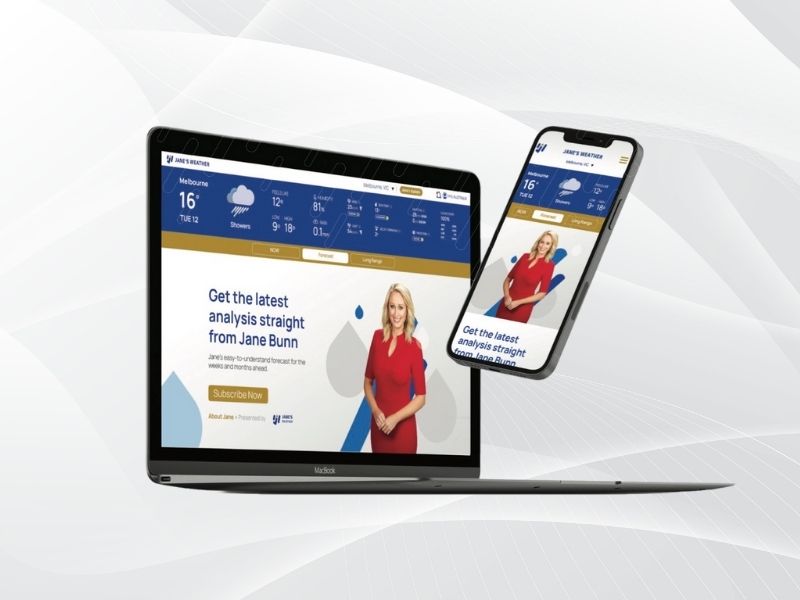
Designing effective UX and UI assets for a farming audience requires a deep understanding of their unique needs, daily routines, and technological comfort levels. The goal is to create digital tools that are not only functional but also intuitive, reliable, and genuinely helpful across various digital platforms, including dedicated applications, informative websites, and engaging social media channels.

The Power of Consistency
As the designer behind Jane’s Weather’s brand identity, I knew from the start that clarity and consistency would be key to building trust and recognition. That’s why I created a comprehensive set of brand guidelines, a visual and strategic foundation that ensures every touchpoint communicates with precision and purpose.
These guidelines go beyond just fonts and colors; they define the tone, mood, and visual direction of the brand, helping internal teams and external partners maintain a cohesive voice.
The result is a unified brand experience that’s instantly recognizable and confidently positioned across all platforms.


