Machinery Conference
Melbourne 2025
Introduction
The PFG Machinery Conference Melbourne 2025 is a national event that unites leading agricultural machinery dealers from across Australia for two days of innovation, training, and connection. Hosted by PFG Australia, the conference serves as a platform to showcase new product launches, cutting-edge technologies, and in-depth training sessions. Highlights include live product walkarounds led by product specialists, with a strong focus on Grass and Cultivation Machinery.
The event brings together renowned machinery brands such as McHale, Kverneland, Vicon, Jaylor, SAM Machinery, Aitchison, Howard, and Maschio Gaspardo.
Cultivation
Aitchison, Howard, and Maschio Gaspardo.
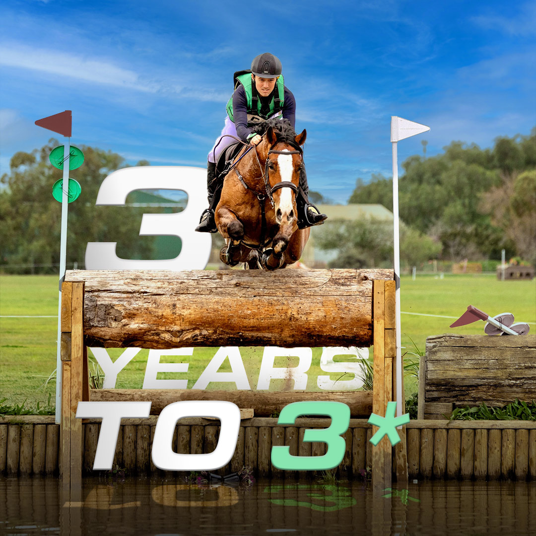
Grass
McHale, Kverneland, Vicon, Jaylor, SAM Machinery,

Project Challenge
The key challenge was the tight two-month timeline from conceptualisation to execution, all while managing the event in-house with the PFG marketing team. Our process began with developing the event identity, starting with the logo design, brand concept, and supporting marketing materials.

The Creative Brief
The client requested a clean, simple, yet meaningful logo that represents PFG Australia and subtly integrates the diversity of the associated brands. The initial suggestion, “PFG National Machinery Conference Melbourne 2025”, was too long to function effectively as a visual identity. Additionally, incorporating all brand colors proved visually overwhelming, risking dilution of the core message.

Logo Concept & Symbolism
The Tree Root, a central visual element in the final logo is the tree root, symbolizing growth, stability, and deep agricultural roots. Each root strand carries a color with symbolic meaning, referencing both brand identity and core values:
Red: Innovation, energy, and forward-thinking
Green: Sustainability and harmony with nature
Yellow: Prosperity and optimism for the future
The intertwining design illustrates how tradition and technology merge, reflecting the conference’s mission to drive progress while remaining grounded in agricultural heritage.
")
The PFG Lines
Another subtle visual cue includes three stylized lines, representing PFG’s presence in Australia, New Zealand, and the USA. Designed in PFG’s brand colors (blue and red), these lines also resemble sky and soil, reinforcing the agricultural connection and visually suggesting cultivated land, a nod to the conference’s focus on machinery and farming.
The Final

Digital assets
Once the logo and brand foundation were finalized, we moved swiftly into the design and rollout of marketing assets to support both pre-event promotion and on-site engagement.
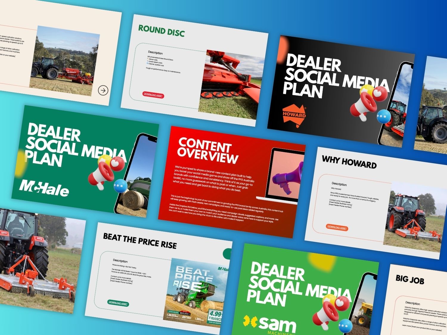
Marketing Materials & Merchandise
We created a suite of branded materials and event touchpoints, including:
Event signage & banners
Printed brochures and digital assets
Social media templates
Speaker name cards
Staff lanyards & credentials
Branded merchandise (t-shirts, caps, notebooks, tote bags, and more)
These assets were designed for visual consistency, scalability, and ease of use across multiple platforms.

Brand Guidelines
To ensure visual consistency across all internal and external communication, we developed a comprehensive Brand Guidelines booklet. This document was designed as a go-to reference for both the PFG team and external partners. It includes:
- Logo usage (full-color, mono, spacing rules)
- Typography and font system
- Brand color palette with HEX, CMYK, and Pantone specs
- Imagery direction and tone
- Layout and composition standards
- Mood & tone reference
This guide played a crucial role in maintaining brand coherence across all assets and channels, streamlining collaboration with vendors and stakeholders.